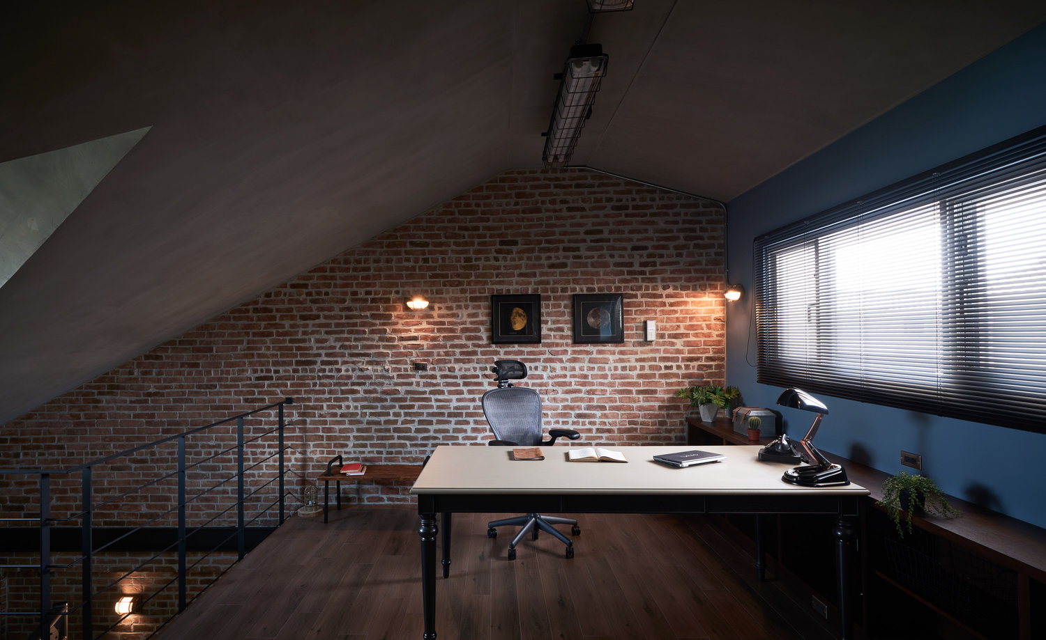
Working from a mezzanine home office that combines privacy from the busy family life so that you can work in peace with great design choices can be transformed from dream to daily reality and routine with the help of architects.
This attic home office transforms the darkness into an opportunity to create light.
Right on top of the family house there was an attic. This space is usually left out from the design. This time, the attic became a stunning dark space shared between different functions.
The home office mezzanine steals the show with a large desk and an accompanying office chair.

This upstairs home orkspace also contains a library that runs all the way down to the lower level, where relaxation is mixed with working out in the mini home gym.
Imagined by HAO Design, this project showcases the way design can split a house in two. The first two floors of this home is for the whole family, including kids, painted in light, cheerful pastels, while the upstairs attic has a relaxation room with a home office on the mezzanine level.
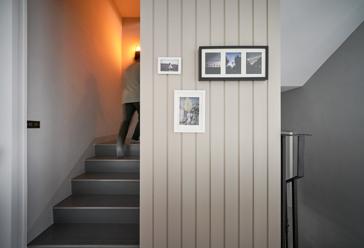
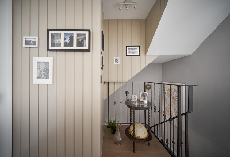
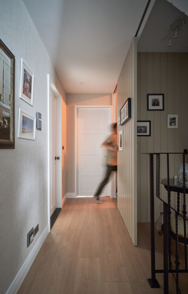
The transition between the two is made with a door that not only closes acces to the upstairs, but also sepparates the color schemes into light and dark.
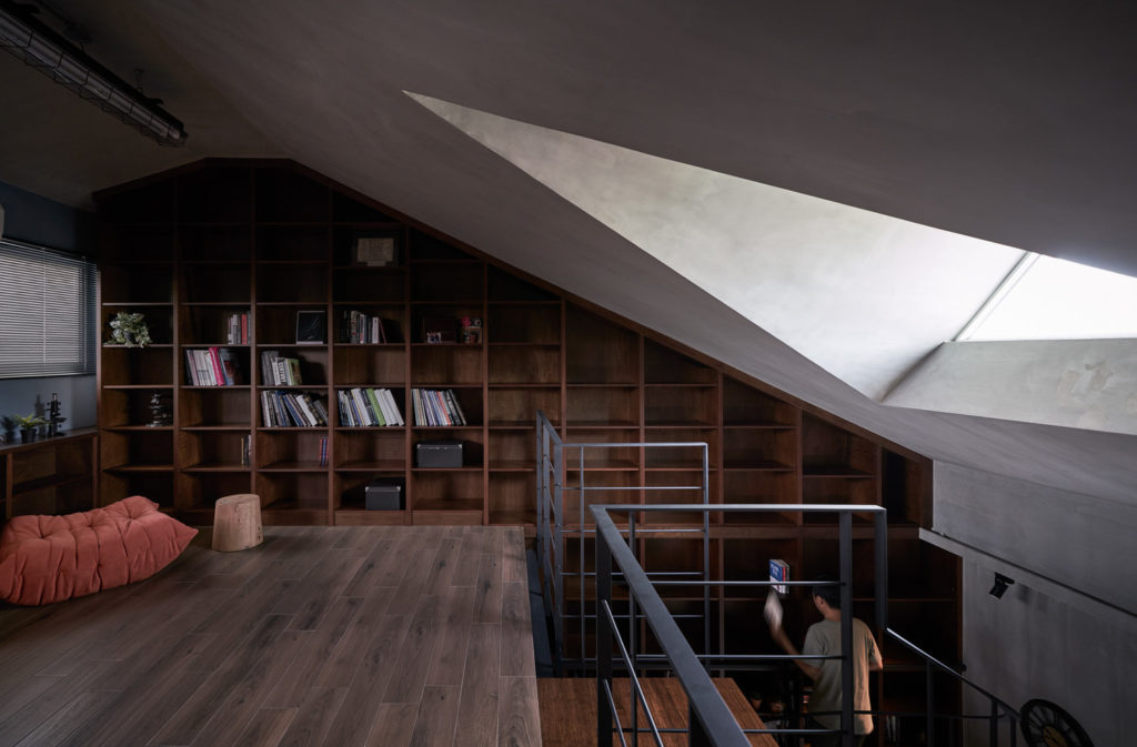
Designers tell us how the project came about:
In order to make full use of the unique triangular skylight in the attic and reflect the master’s love for the industrial Loft style, Ivan decided to draw inspiration from the ‘Batman’ movies, making the upper floors and basement (including the garage and storage room) a chic and elegant retreat that is fit for urban professionals.
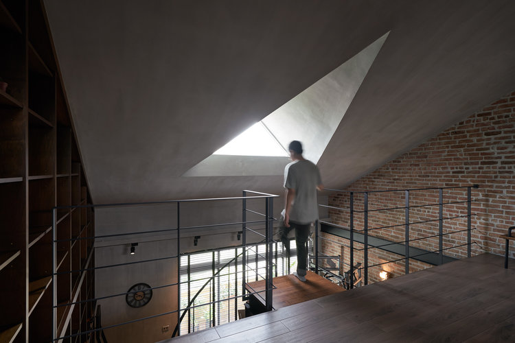
Here is how the functions were split to create different areas and keep everything in the same design theme:
The highlight is a black iron spiral staircase on the 4th floor (where the gymnasium, video and leisure room are located) leading to the attic (study). The spiraling railings resembles the endless pirouettes of the ‘black swan’ of ballet. It not only makes effective use of the space below, but is also a romantic ascent to the skylight. Moreover, it serves as a 360-degree viewing gallery of the magnificent ‘bookcase wall’ under the inclined roof.
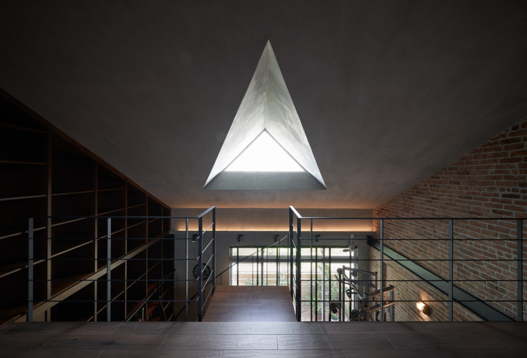
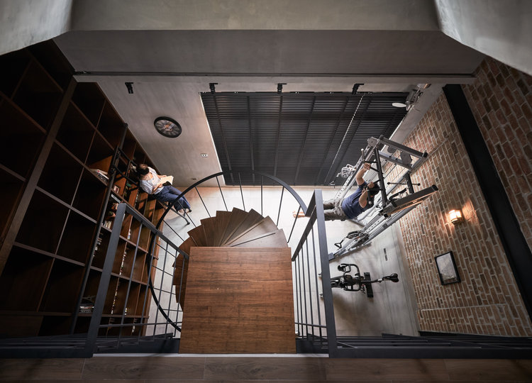
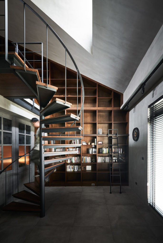
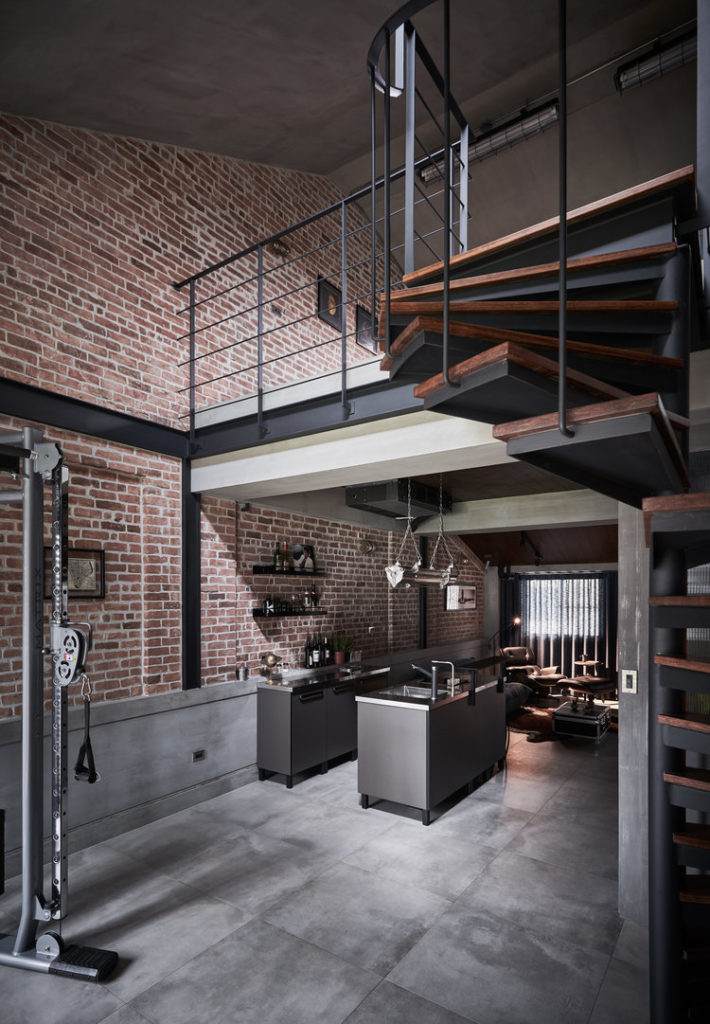
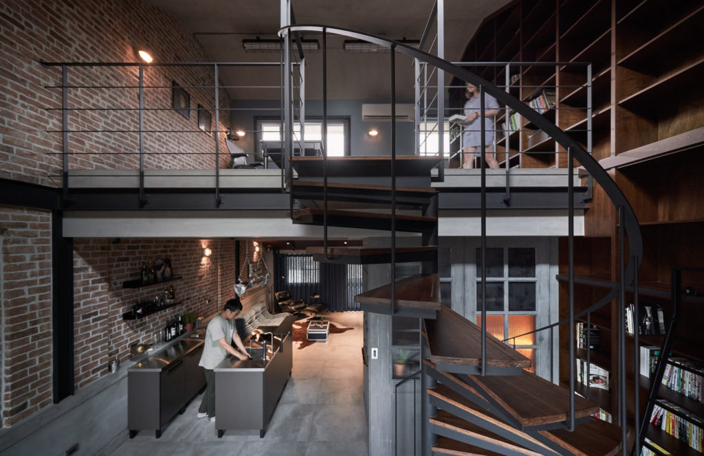
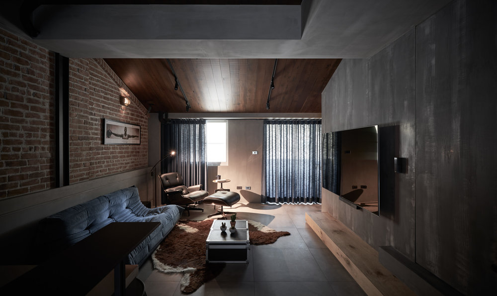
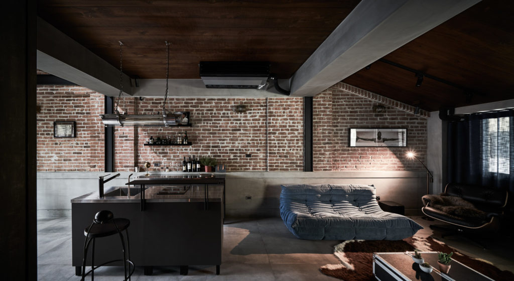
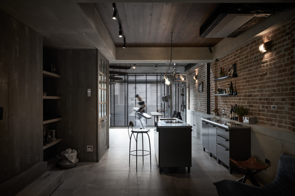
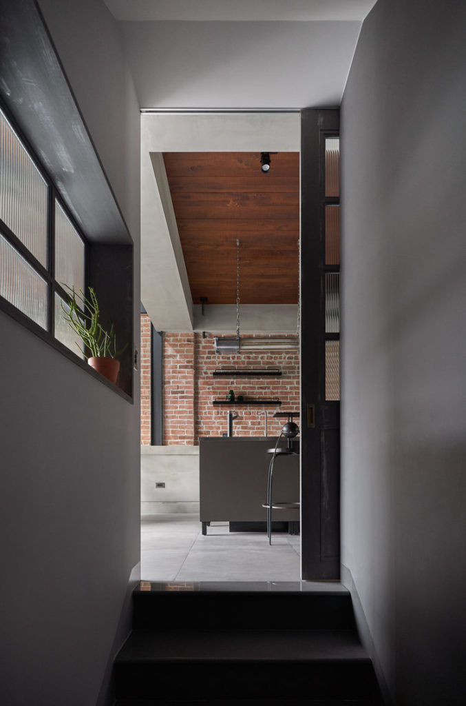
The connection made with the lower part of the house is delineated with frosted glass that makes the visual connection to what we’re about to find in the formely forgotten attic:
According to the designer Ivan Chen, without obvious functionality assigned, attics often get left as wasted space by designers.The upper part is made of black square frosted glass to let light come through concealed sliding doors installed between the 3rd and 4th floors. When needed, the stairway can be closed off to prevent the children from running through. Beautiful details are celebrated through a balanced flow, which in turn brings a sense of discovery to a seemingly ordinary independent home.
There are more ideas than you think available out there. Inspiration comes from both ordinary things and great art. Here are more ideas to keep you inspired:
10 Home Workspaces Flashing Exposed Brick Walls
