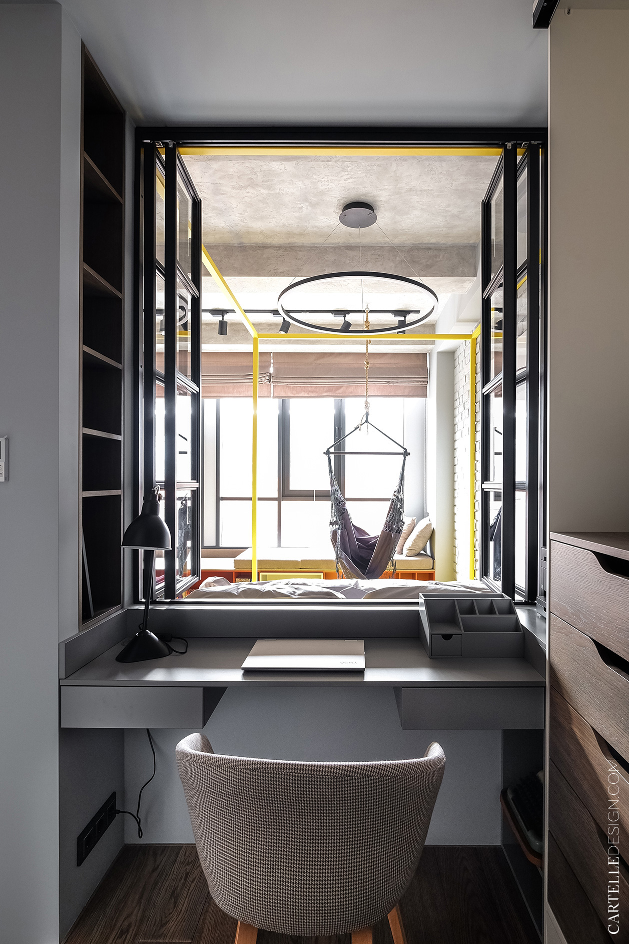
We’ve seen work desks placed under a window before. But this space we’re exploring today is so refreshing because it reminds us that not all windows must open to the outside – some windows open to the inside.
A young girl in Moscow got her dream home in this studio apartment with the help of Cartelle Design.
With a brifing that included wanting a “stylish and interesting space”, designers set out to compose a minimalist design for the functions of a studio apartment that honors the owner’s wishes and needs.
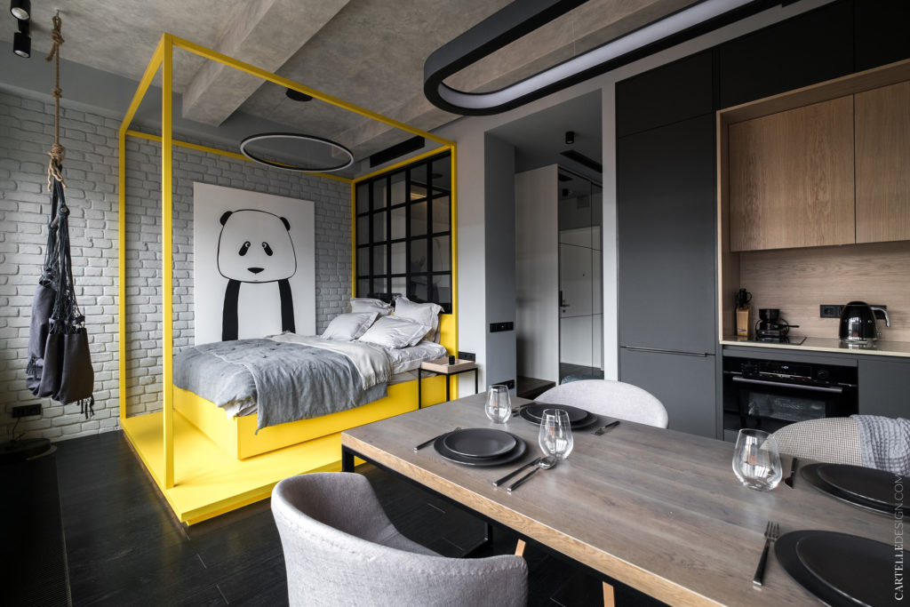
About the chosen color palette, designers explain: “The main color scheme is monochrome. Light gray walls, ceiling and textiles, dark floor, black metal elements, and a little light wood on the facades of the cabinet furniture.”
Designers tell us why they chose the minimalist style: “Minimalism with loft elements was chosen as the main style. The space itself, with high ceilings, beams on the ceiling and a panoramic window, already set a special mood. When redeveloping, it was decided to use a minimum of partitions.”
A minimalist style in grey and wood is interrupted by the bright yellow bed frame and platform. Reinterpreting the poster bed, this masterfully executed pop of color makes the whole space richer in depth.
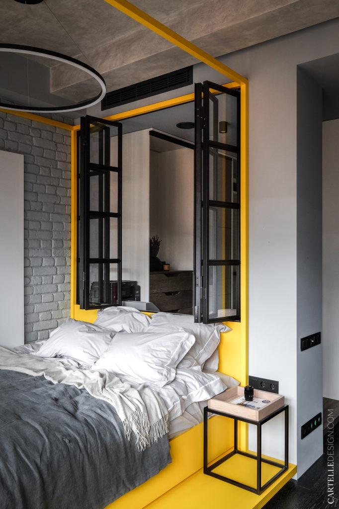
A white brick wall with art work and floating round light above the eye-catching yellow bed is the main attraction point. Framed windows at the head of the bed hint to something wonderful happening on the other side. This black framed glass sparks curiosity.
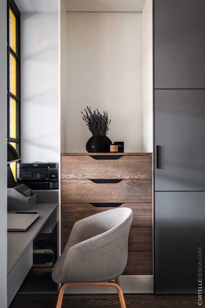
And once you walk behind the mirrored wardrobe at the entrance, a cosy workspace quenches that thirst for knowledge.
This small yet coquettish space was possible thanks to the designers who cut off a loft window in between the kitchen-living room space and the wardrobe, creating the oportunity to place a workspace right under the window inside the walk-in-closet.
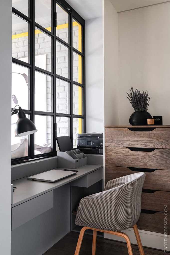
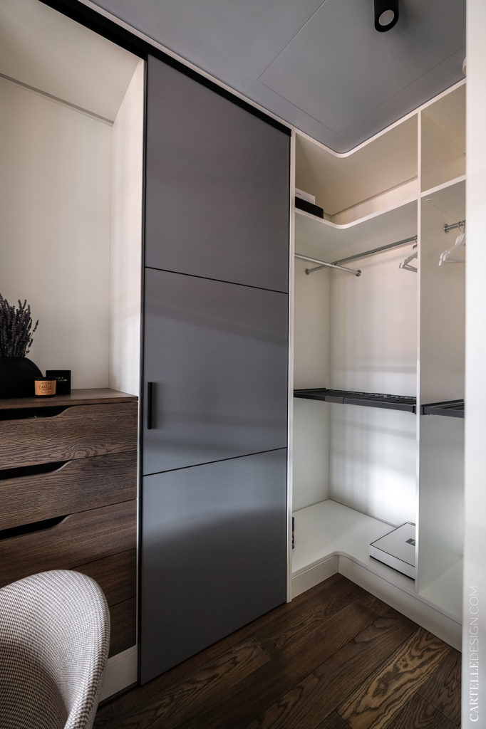
Plenty of storage space behind the work chair and not too much elbow room on the desktop – as the space permited.

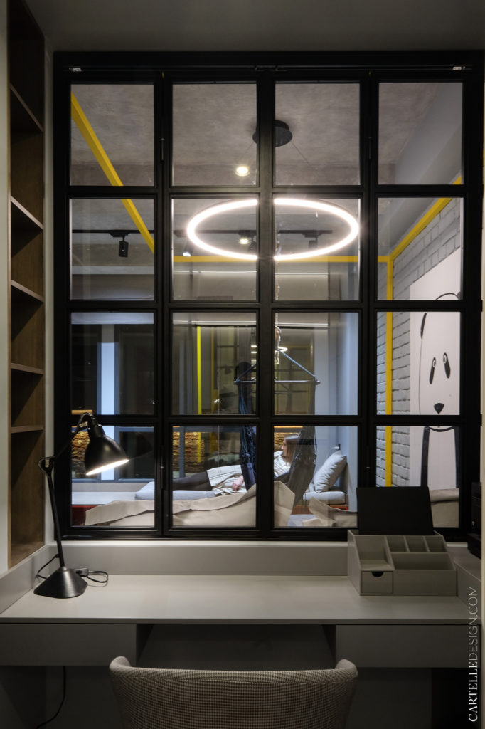
Between the working area and the rest of the apartment’s open space, a window opens at the head of the bed. This brings in light and fresh air, circulating the sunshine all around.
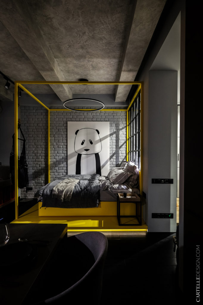
Illumination creates moods. Thanks to the designers, we get to understand how they think about light: “There are several lighting scenarios in the room. For uniform illumination of the entire space, rotary track and spotlights are used. The kitchen and bedroom area is decorated with minimalist metal chandeliers.”
And that light seen at night coming from late working hours make this space even more surreal.
Spaces are meant to create moods. Go deeper into this calm, soothing feeling with these:
