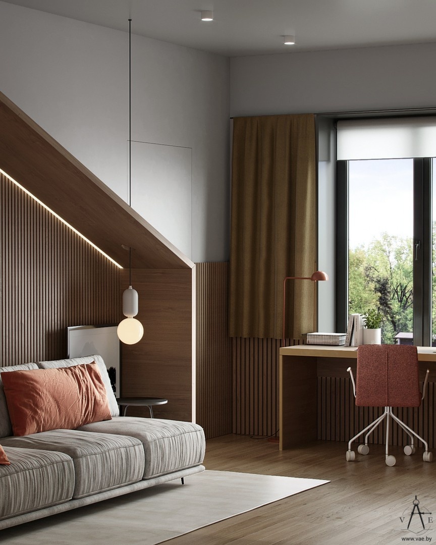
Going back to school as a teen is different – you get to learn more things as you go through a hormonal storm. This is one of the reasons why a well-designed private space where you can sleep, play and study sets the tone for further development.
We love seeing simple designs that maximize the space and stylishly display basic functions needed for a well-rounded teen lifestyle.
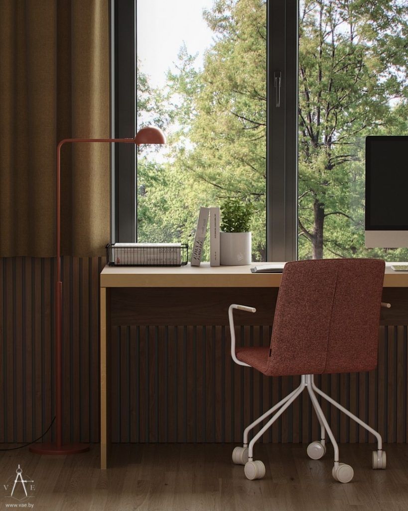
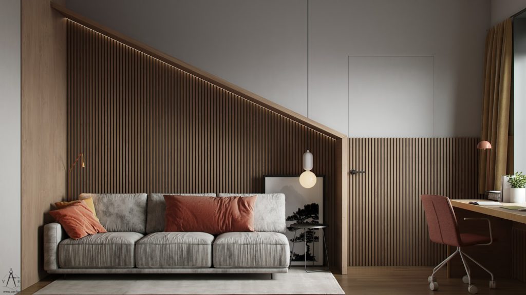
Designed by VAE Design & Architecture for a family with three children located near Minsk, this teen bedroom is an example of how pre-planning and reducing everything down to basic shape can construct an inspiring space.
Simplicity allows for the teen’s thoughts to be orderly, as the external environment infuences internal mood. Important especially during these transformative years, an organized space helps with the transition into adulthood.

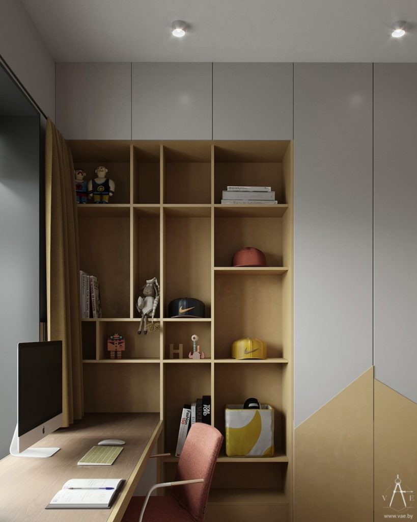
If it weren’t for the decor seen on the little shelves near the desk, it would be hard to imagine a teen lives here. But you can compare it to the siblings’ bedroom and see that minimalism is a given in this home’s design.
The other bedroom in this home was built for two kids and you can see it here: Back-To-School Minimalist Kids Bedroom Study Setup.
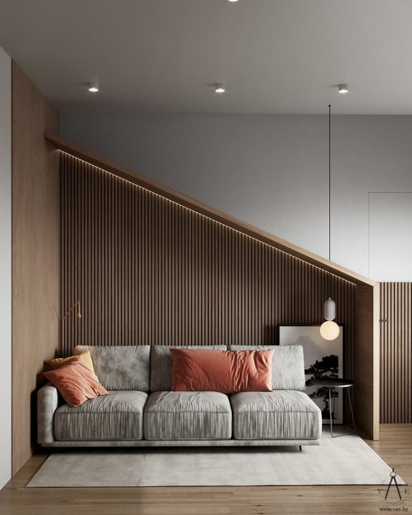
Slated walls define a highly modern design that cradles an extendable sofa and makes it both physically and visually appealing to spend time in this space. An almost hidden door stands between the sleeping area and the study desk placed under the window.
This is one of the best placements for a desk – under the window – and we have more ideas to inspire your home workspace design here: 30 Inspiring Workspaces Burrowed Under a Window.
Keeping a basic white paint job allowed designers to create asymmetry using design lines, colors and textures. Light was used not only to illuminate the space, but also define details – like the slated wood decor shaping the sleeping quarters.
Three more lamps – a colour-coded floor lamp on one side of the sofa and a hanging lamp on the other side, plus the copper lamp on the desk – give depth to the bedroom, while ceiling spots ensure bright illumination when necesarry.
This asymetric design draws inspiration from the mind of the designers and pours it into this teen’s daily experience in his well designed environement. Colors used create a calming effect: monochromatic color choices were blended with warm wooden insertions and flooded with natural light.
The interior is made in rather calm monochrome colors, decorating with copper details seen throguhout the rest of the house and acting as unifying detail.
Designers tell us how they ended up with these particular design choices starting from the family’s needs: “A small amount of furniture, objects and decor in the house creates a sense of order and cleanliness, and there are also three active boys in the family, for whom a lot of free, not overloaded space is always required.”
This is a great room to grow into, since it can be easily used by a kid, a teen and a young adult. Here are a few more ideas to keep you inspired:
Black & Yellow Bedroom and Study Spaces for Teens
